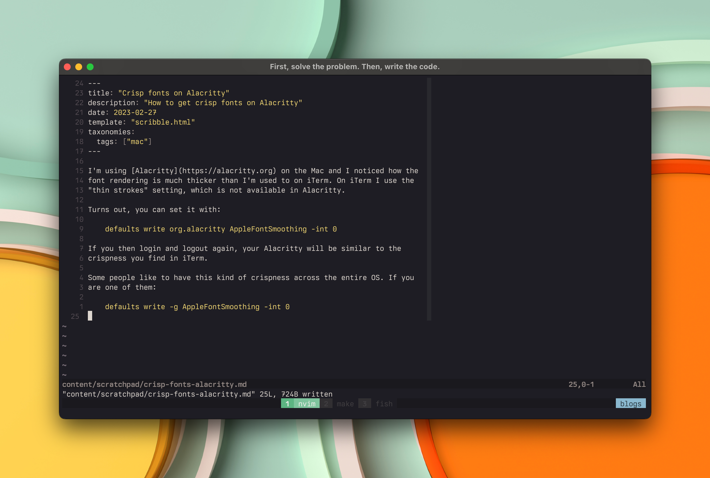
I’m using Alacritty on the Mac and I noticed how the font rendering is much thicker than I’m used to on iTerm. On iTerm I use the “thin strokes” setting, which is not available in Alacritty.
Turns out, you can set it with:
defaults write org.alacritty AppleFontSmoothing -int 0
If you then log in and logout again, your Alacritty will be similar to the crispness you find in iTerm.
If you want to restore it back to the default, do:
defaults delete org.alacritty AppleFontSmoothing
And if you like to have this kind of crispness across the entire OS. Do:
defaults write -g AppleFontSmoothing -int 0